2028 Olympics Project
Graphic Design VII - Spring 2025
Designing for the 2028 Summer Olympics helped me grow as a designer by teaching me how to create a clear and meaningful look that could be used everywhere like with poster ads and signs and merchandise. I focused on building a style that felt unified and represented the energy and spirit of the Olympics. This project showed me how to communicate a strong message across different platforms in a way that connects with people from all over the world.
Research
I selected Seoul, South Korea, as the host city for the 2028 Summer Olympics because it embodies global appeal which is a core value of the Games. During my research I learned that Seoul has established itself as a thriving, global landmark, known for its innovation, high-tech advancements, and forward-thinking vision. As the epicenter of the Korean Wave, the city captivates audiences worldwide, much like the Olympics, which unites people across nations in a shared celebration of sport and culture. Seoul’s message of global unity and connection makes it the perfect stage for the Games.
Seoul’s unique blend of tradition and modernity is reflected in its skyline, where futuristic skyscrapers are next to historic villages. For this Olympic brand, I developed a sleek, high-tech aesthetic inspired by traditional Korean symbolism that ranges from the iconic finger heart to the intricate patterns of ancient palaces thus creating a visual identity that bridges the past and the future.

Color Palette
The bright blue, hot pink, and light pink colors were chosen to reflect the vibrant pop culture of Seoul. These bold, fun colors are often seen in K-pop album art and represent the energy, creativity, and modern style that Seoul is known for. They help tie the Olympic brand to the heart of the city that is full of passion, youth, and global influence to make it feel fresh and exciting.
Logo Concept & Construction
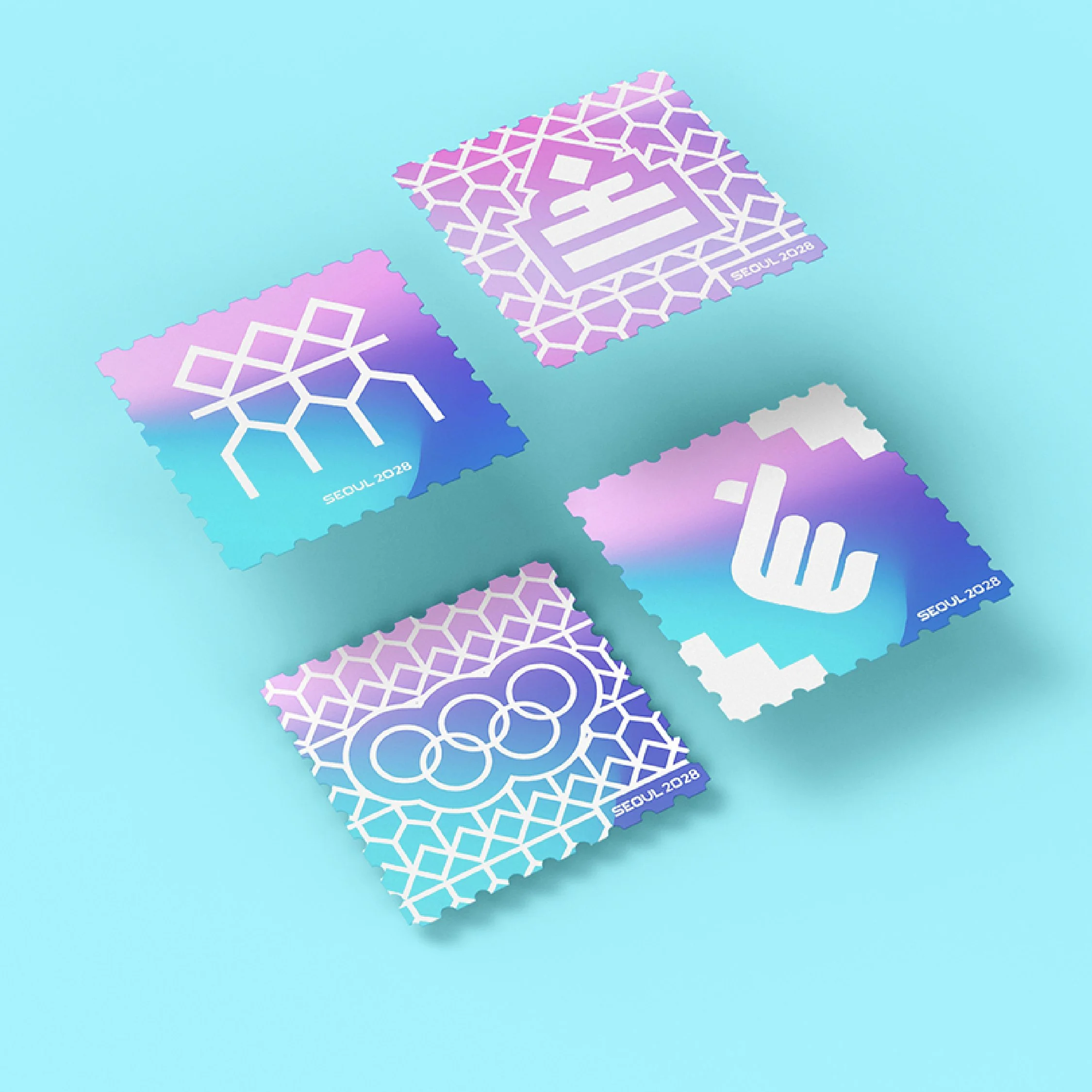
The Korean finger heart is a perfect symbol for the 2028 Olympics in Seoul because it represents love, admiration, and connection which are all values that bring the world together during the Olympic Games. It's a small gesture with a big meaning, showing the passion athletes have for their sport and the support fans give from around the globe. As a logo, it captures the heart of Seoul and the spirit of unity that defines the Olympics.
The logo for Seoul 2028 was designed to balance both style and function. I matched the sharp and rounded edges of the finger-heart icon with custom typography to create a sleek, high-tech look that still feels welcoming.


Typography & Slogan
I picked Apple SD 산돌고딕 Neo as the typeface for the Seoul 2028 Olympics. It works well in both Korean and English, which is perfect for an international event in Korea. It has a clean and modern look that matches Seoul’s high-tech vibe, and it’s super easy to read. Using this font helps connect people from around the world while still inclusing the host city’s written language.
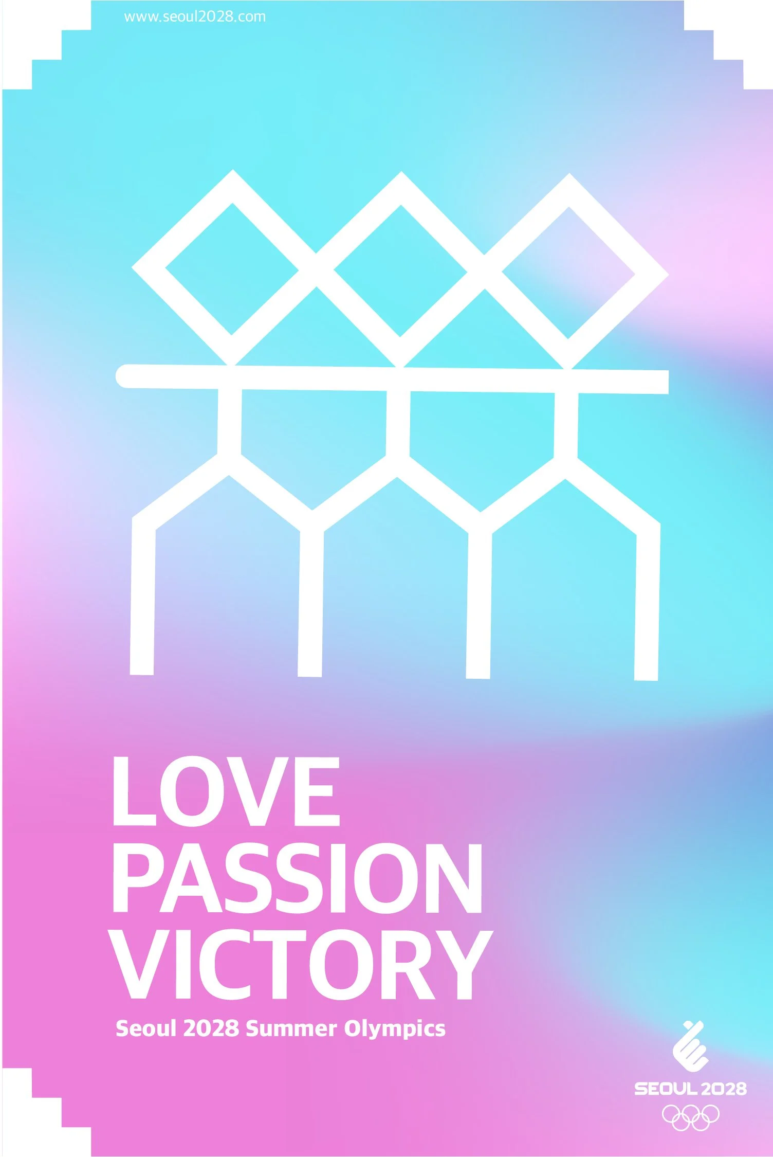
The slogan Love. Passion. Victory. was chosen to reflect the heart of the Olympics. It connects to the finger heart icon and shows the world’s love for Seoul and its vibrant culture. It also represents the passion athletes have for their sports and the love and support they get from fans around the globe.
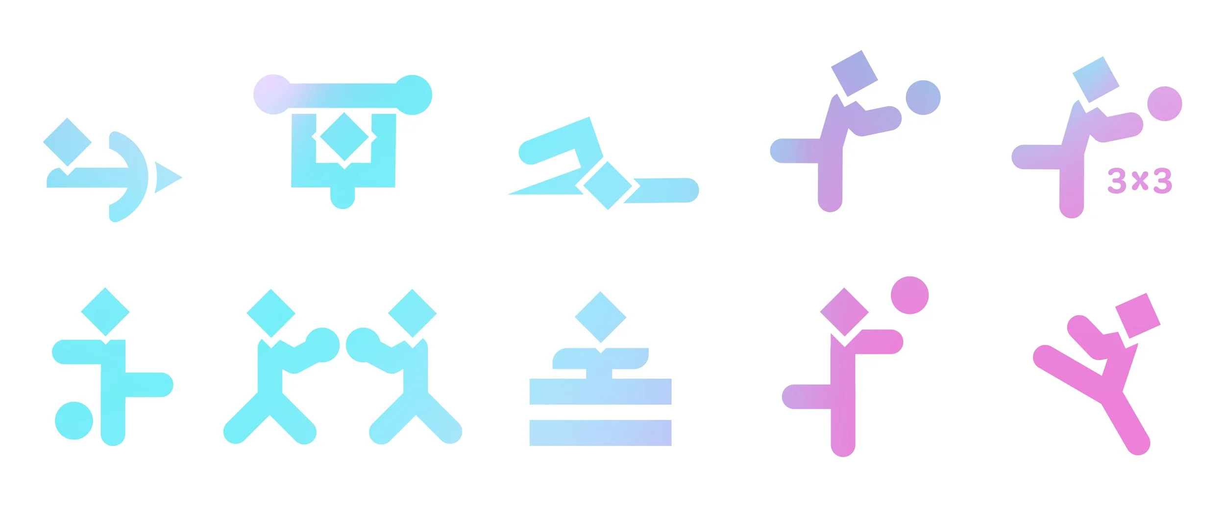
The pictogram’s form is inspired by the letterforms in Hangul (Korean Writing System).
ㄱ ㄴ ㄷ ㄹ ㅁ ㅂ ㅅ ㅇ ㅈ ㅊ ㅋ ㅌ ㅍ ㅎ ㅏ ㅑ ㅓ ㅕ ㅗ ㅛ ㅜ ㅠ ㅡ ㅣ
서울특별시
Pictograms
Left to Right
Archery, Weightlifting, Aquatics, Basketball, 3x3 Basketball, Football (Soccer), Boxing, Gymnastics, Volleyball, Taekwondo
Poster Design Concepts
Concept 2 I designed 3D glass rings in Maya that are the colors of the Olympic logo to give a modern twist to the traditional symbol. These rings bring the flat design into a more dynamic, futuristic form that reflects Seoul’s identity as a high-tech, forward-thinking city. They align perfectly with my brand’s goal of blending tradition with innovation. I hope to expand on this in the future and bring more of this imagery into the brand.

Concept 1 I included a symbol in my Olympics branding inspired by the geometric pattern found on Gyeongbokgung Palace in Seoul. It looks like linked arms, which help my brand message connect Korean tradition with the shared spirit of the Games.
Here are the brand’s deliverables: