

Frank’s Pimento Cheese has its roots in the long history of Frank’s & Frank’s Outback Restaurant AKA Frank’s Restaurant & Bar in Pawley’s Island, SC. The restaurant remains a staple of the local food scene, known for its Southern hospitality and high-quality offerings. My intern team included me, the creative intern, a project manager intern, social media intern, and a public relations intern. We fully redeveloped Frank’s brand and personality. This is my contribution to the team as the creative intern.

Client Logo The client did not have a digital version of their restaurant logo so I created an updated version referencing a photo of their restaurant sign! I also created a second design that references the Goods To Go business that operates under Frank’s Restaurant & Bar. So the logo still has the recognizable Frank’s with more usability options.
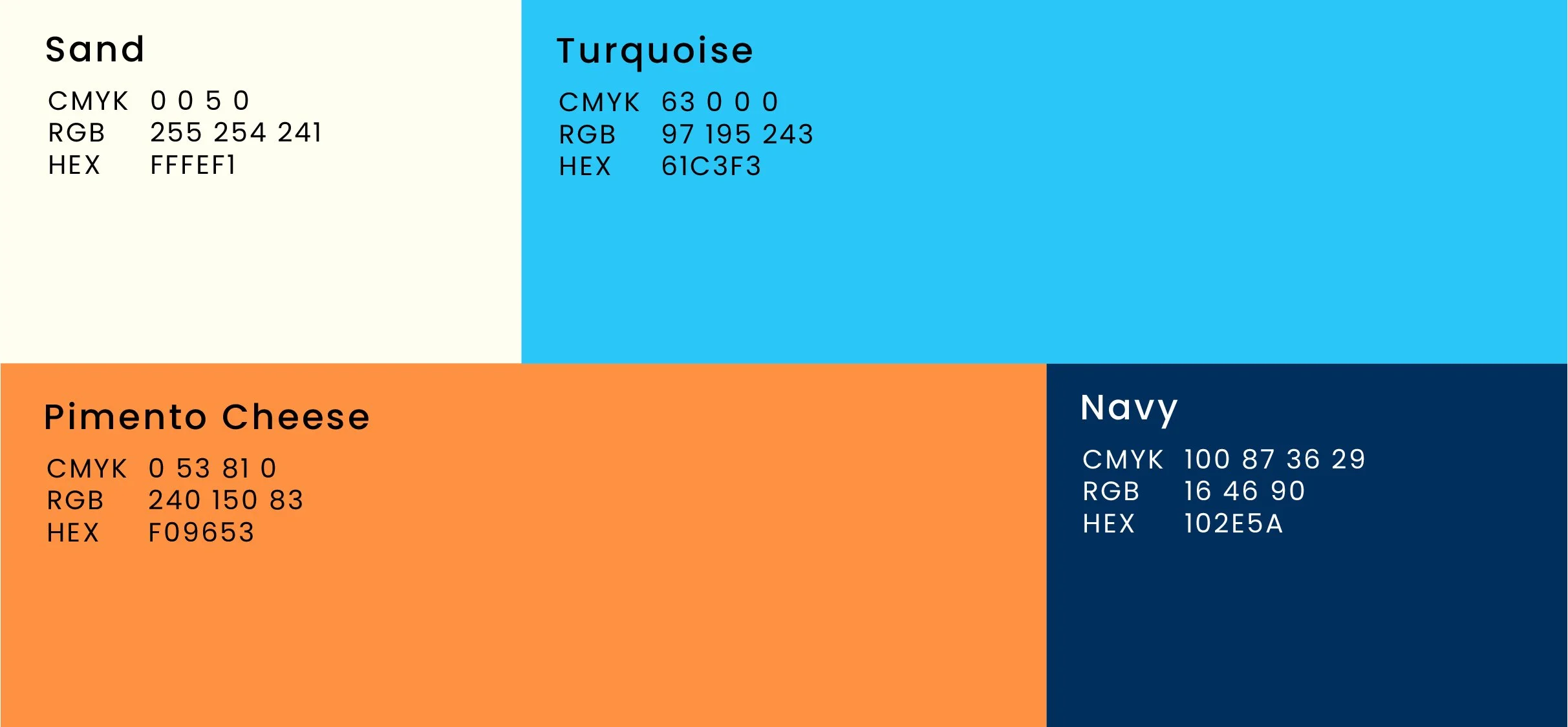
New Brand Colors The color palette for Frank’s Pimento Cheese mixes classic and playful vibes. Navy feels timeless and trustworthy, like a family recipe. Turquoise adds a burst of fun, keeping things light and modern. The pimento cheese orange ties to the product and feels cozy and inviting. The sandy hue in the packaging brings a soft, beachy touch that makes the brand feel friendly and easygoing. Altogether, the colors feel nostalgic yet fresh, giving the brand a warm, down-to-earth personality.
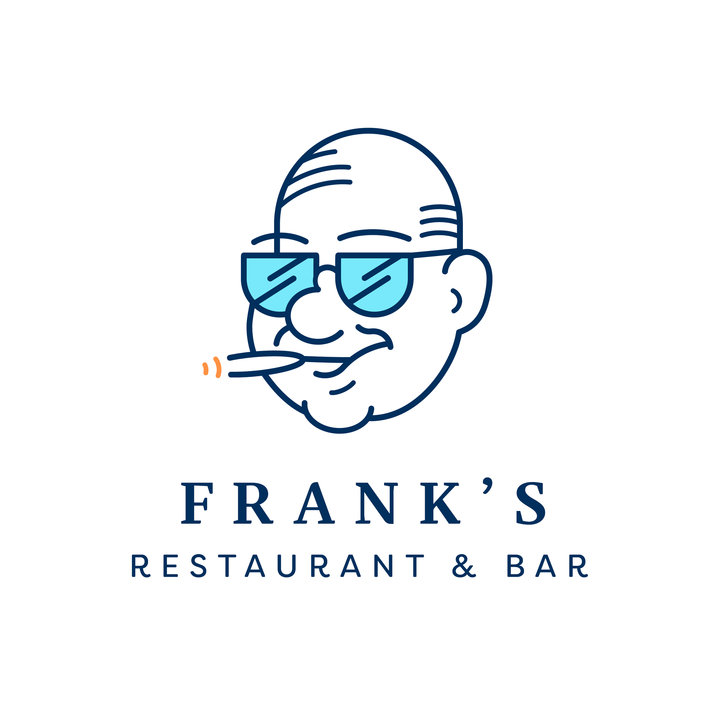
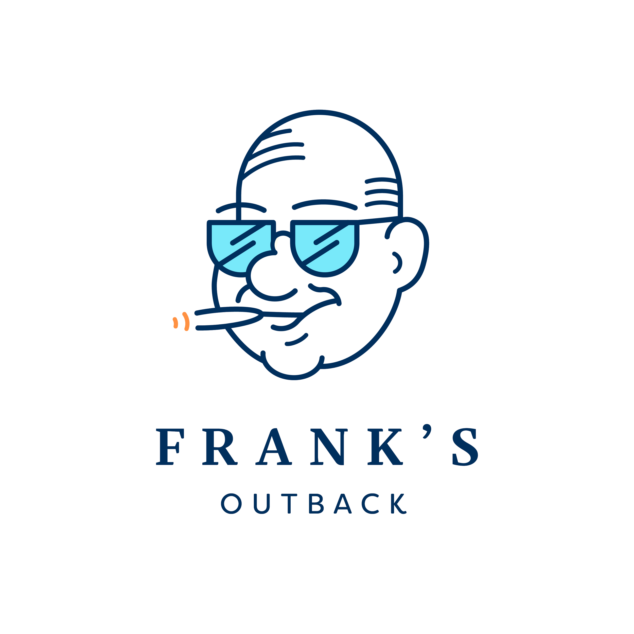
Logo Exploration For this brand refresh, I had the opportunity to bring new life to the character of Frank from their original packaging. I redrew Frank in a clean, playful, more distinctive illustration style that feels approachable and memorable while still nodding to the brand’s roots. I also added the subtext under “Frank’s”. By using “Goods To Go,” I created flexibility for the brand to cover more than just pimento cheese as it opens the door to all the facets under Frank’s name, without losing that small-town, friendly feel. Altogether, the new logo and type system keep things simple and adaptable.
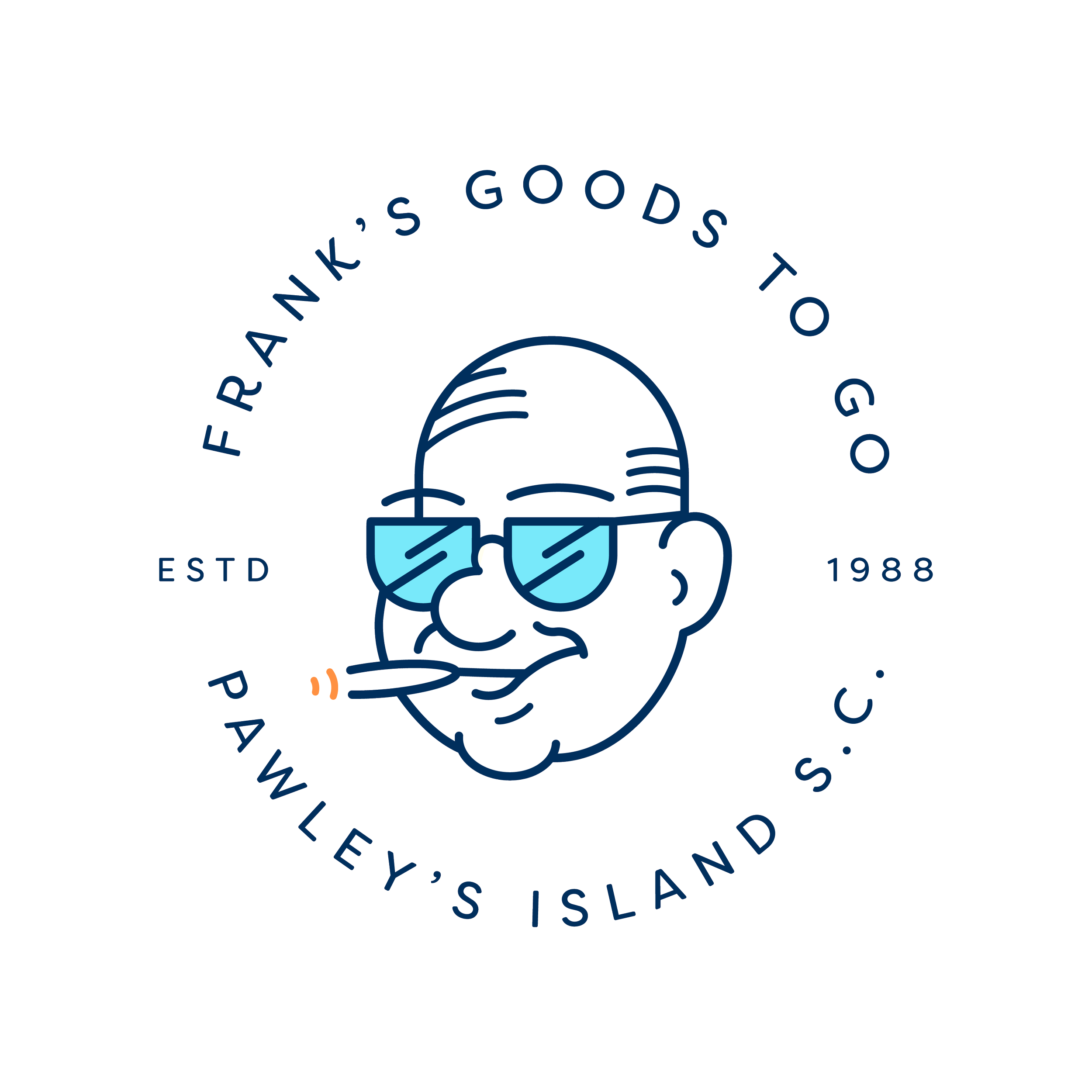
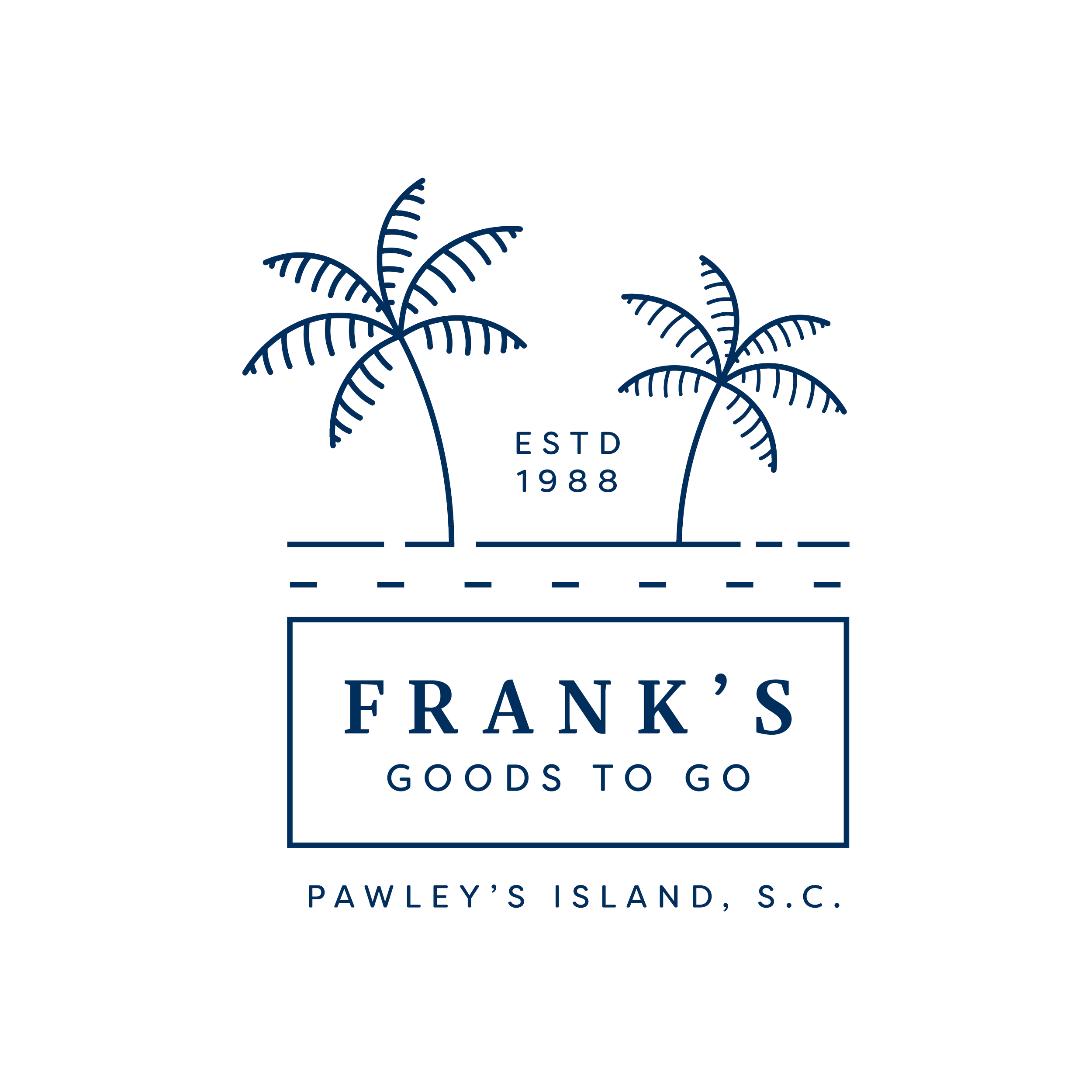
The emblem logo with Frank’s face brings out the fun, local charm of the brand. It feels like something you’d spot on a local shop sign, warm and familiar, and ties right back to the easygoing spirit of the South. The palm tree destination logo plays up the coastal vibe of Pawley’s Island, proudly showing off where Frank’s got its start. Together, these logos keep things classic and community-focused, telling a story that’s rooted in Southern hospitality and a love for local tradition. It’s a look that’s simple and honest.
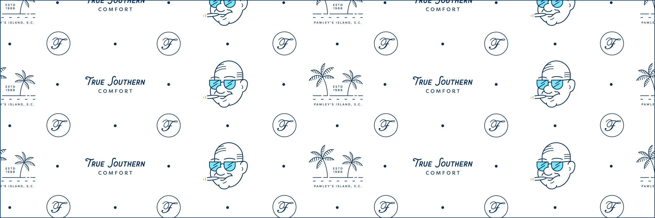
Pattern Design This pattern brings together all the core brand elements, including the destination logo, Frank’s caricature, the “True Southern Comfort” slogan, and the classic ‘F,’ into one versatile design. It captures the playful, laid-back feel of Pawley’s Island along with the warmth of Southern comfort food, keeping the brand consistent and easy to recognize. Whether paired with the full restaurant logo or the new caricature logos, it adds a fresh, flexible look that would fit perfectly across other design endeavors.
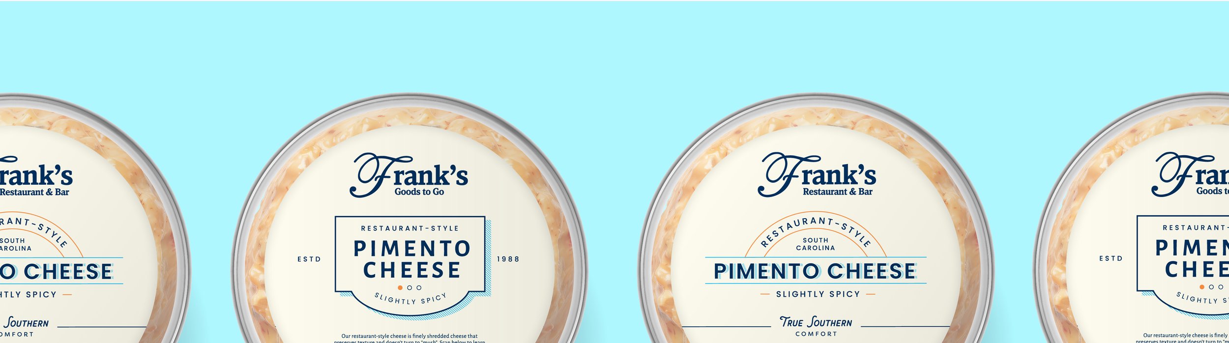
PACKAGING DESIGNS
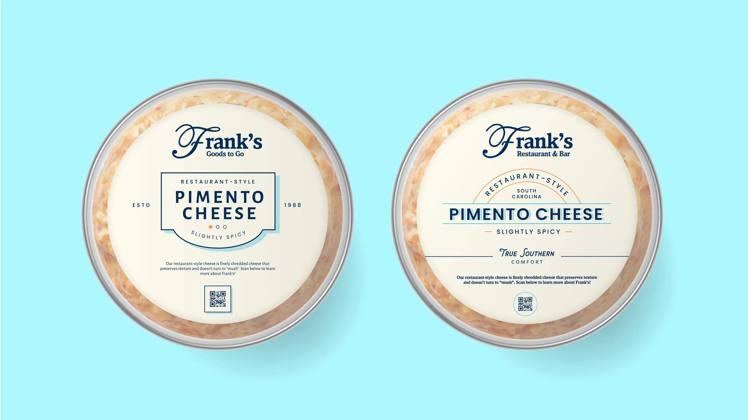
I created two options for a pimento cheese packaging design. Each of these designs pull from an antique and classic style with the usage of crests and emblems! I created a modernized design with a classic feel as Frank’s is an established community symbol. I utilized elements that give a pop of color to pop out from the “sea of orange” amongst other pimento cheese brands on the shelves. I also wanted to add the usage of a spice meter with the rising popularity of spicy foods on social media platforms like Youtube and TikTok.